In this article
Most new businesses in Pakistan start with a logo made in a weekend, then spend the next two years fixing it. The sign uses one green, the menu uses another, the Instagram posts use whatever the designer that week preferred, and customers never quite remember the name. Brand identity design in Pakistan does not have to go that way. A proper identity is a system, and it can be done properly in a few weeks.
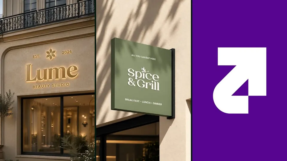
This year our studio built three complete identities for businesses that were about to open their doors: Spice & Grill, a restaurant; Lume Beauty Studio, a beauty studio; and Capxa, a growth marketing agency. Three very different buyers, one process. Here is that process, from the first brief to the brand book, with what each project actually delivered.
Three identities, one process
What we delivered for three new Pakistani businesses in 2026.
Quick answers
What is included in brand identity design?
A complete identity covers the logo and mark, a colour palette, a type pairing, patterns and usage rules, and every place a customer meets the brand: signage, packaging, uniforms, social templates and stationery. It ends with a brand book, one document your team, printers and any future agency can follow.
How long does a brand identity take in Pakistan?
Most of our identities take two to four weeks from brief to brand book. Week one is the brief and research, weeks one to two are concept directions, weeks two to three refine the chosen direction, and weeks three to four produce the brand book and launch content.
What is a brand book and do small businesses need one?
A brand book is the rulebook for your identity: which logo goes where, the exact colours, the fonts, the spacing and examples of it all in use. Small businesses need it most, because they usually work with several printers and freelancers, and the book is the only thing that keeps them consistent.
A logo is the smallest part of a brand
When clients come to us asking for "a logo", we ask where a customer will first see it. For Spice & Grill, that was a hanging sign on a street and a takeaway bag in someone's hand. For Lume, it was a shop front, a reception desk and an Instagram grid. For Capxa, it was a social feed and a pitch deck, because an agency is judged by its own brand before anyone sees a client result.
That question changes the whole job. A mark that looks lovely on a white screen can fall apart on a three-metre sign, embroidered on an apron or shrunk to an app icon. So we design the logo, the colours, the type and the tone together, and we test them in the real places they will live.
The brand identity design process we use, step by step
From brief to brand book
The four stages behind every identity on our portfolio.
The step most businesses skip is the second one. A mood board full of other people's work tells you very little. A concept shown on your own shop sign, your own packaging and your own phone screen tells you almost everything. You approve the brand in the world it will live in, not on a slide.
Spice & Grill: an identity with heat in it
The brief was simple to say and hard to do: a restaurant identity that feels warm and appetising and works everywhere a customer meets it, from the sign outside to the takeaway bag.
We built it around a flame mark that sits on the "i" of Spice, with an olive and cream palette instead of the red and yellow so many grills reach for. Then we carried it through:
- Logo lockups for the sign, the menu and small uses like stickers.
- A menu system, so new dishes and seasonal menus slot in without a redesign.
- Signage, including the hanging sign with "Breakfast, Lunch, Dinner" underneath.
- Uniforms and stationery: aprons, cups, business cards and letterheads.
- Takeaway packaging: boxes with a branded band and bags in olive and cream.
- The full brand book, plus a short film revealing the mark for launch.
Restaurants are remembered by feel as much as by food. When the menu, the packaging and the staff all look like one place, every future campaign has a system to build on. If you run a restaurant, our post on restaurant and bakery marketing in Multan covers what comes after the identity: the photography, the films and the ads.
Lume Beauty Studio: premium from day one
Lume was a new beauty studio that needed to feel established on opening day. Beauty clients judge a studio before they book: the sign, the reception, the packaging and the Instagram grid all have to feel like the same place.
We designed the name lockup and a gold flower mark, a deep wine and cream palette, a type pairing and a flower pattern. Then we put all of it to work: an illuminated shop front sign, a reception wall, interior shelving, uniforms, gold foil stickers, a serum bottle and gift box, and a hardback brand book. Before anything was printed, every touchpoint was shown as a photoreal mockup, so the owner could see the studio as a client would.
We also cut two brand films for the launch. The full case study has all 12 identity boards and both films on the Lume Beauty Studio page.
Capxa: an agency that had to look like its results
Capxa is a growth marketing agency, and agencies have a particular problem: prospects judge their taste from their own brand. If the agency looks average, nobody believes it can make their brand look better.
We drew an arrow mark on a 45 degree grid, so it reads as growth and works as a bold app icon. We paired it with a violet colour system and a clean type pairing, then built signage and stationery mockups, social templates, a launch reel and seven launch posts. The launch posts were not decoration. They sold the service: case-study style posts on real store results, a creator call-out, and a clear "Get your free audit" offer at the bottom of each one.
Every post came out of the same template, which is the real value of a brand book. You can see the book, the reel and the posts on the Capxa case study.
What every new brand identity should leave you with
The brand identity checklist
If your designer cannot hand you these, you have a logo, not an identity.
Mistakes we see in Pakistani brand launches
Choosing the category colour. Many grills use red and yellow, many tech firms use blue. Spice & Grill went olive and cream, and Lume went wine and gold, so both stand apart in their own street and in the feed.
Approving on a white background. A logo is never seen on white in real life. Ask to see it on the sign, the bag and the phone screen before you sign off.
Skipping the brand book. Without it, the second printer guesses, the third freelancer guesses, and in a year the brand has drifted into five versions of itself.
Launching quietly. A new identity deserves a moment. A logo film and a first month of planned content, built from the same system, gives people a reason to notice the change.
Brand identity design in Pakistan: what to take away
- Design the system, not just the logo. Mark, colour, type and tone, together.
- Start from where customers meet you. The sign, the box and the feed decide what the identity must do.
- Approve on mockups. Two or three directions shown in the real world beat any mood board.
- Get the brand book. It is what keeps every future post, print and campaign consistent.
- Plan the launch. The identity and the first content should arrive together.
Our full process, the logo films and more identities, including the lightning S and 3D mascot for Shan Electronics, are on the branding and identity service page. If you are comparing studios first, our guide on how to choose a digital marketing agency in Pakistan covers the questions worth asking.
If you are opening a new business, or your current brand has drifted into five versions of itself, message us on WhatsApp. I am happy to talk through what your identity needs to do.
Want this for your brand?
Video, brand identity, Meta ads and social media, made in-house by our team in Multan. Tell us what you are building.

Founder of Digital Lineup, a content production and digital marketing agency in Multan, Pakistan. Four years of brand films, Meta ads, identities and social media for brands in Pakistan and Australia.